When Apple showed the iPhone Duo, I kept staring at the status icon that combines several readings into one small mark. My first thought was that I needed it on my Mac. And I started building DuoBar right away, and finally after long hours of development and fine tuning - it's live on the App Store now!
Problem:
On my 14" MacBook Pro, the right side of the menu bar was mostly Apple's own icons: Wi-Fi, battery, sound and Bluetooth, each in its own slot with its own menu. macOS 27 can hide what doesn't fit, but those are the ones I actually look at. Hiding never worked for me, so I merged them. I wanted all of them at a glance in the space of one icon, with their controls one click away.
Solution:
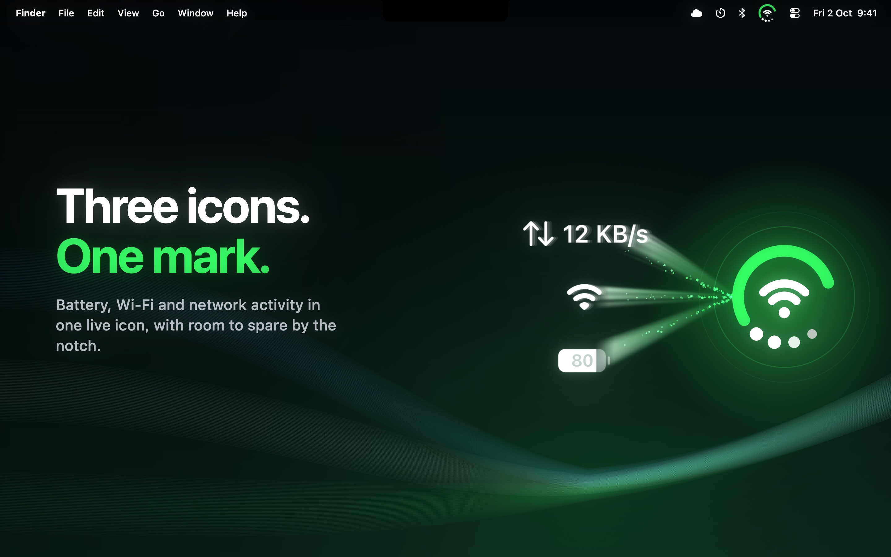
DuoBar is a ring, a center glyph and four dots just like the status indicator of iPhone Duo. By default, the ring is your battery, the center is Wi-Fi and the dots are network activity, and all three move as things change.
Hover and it unfolds:
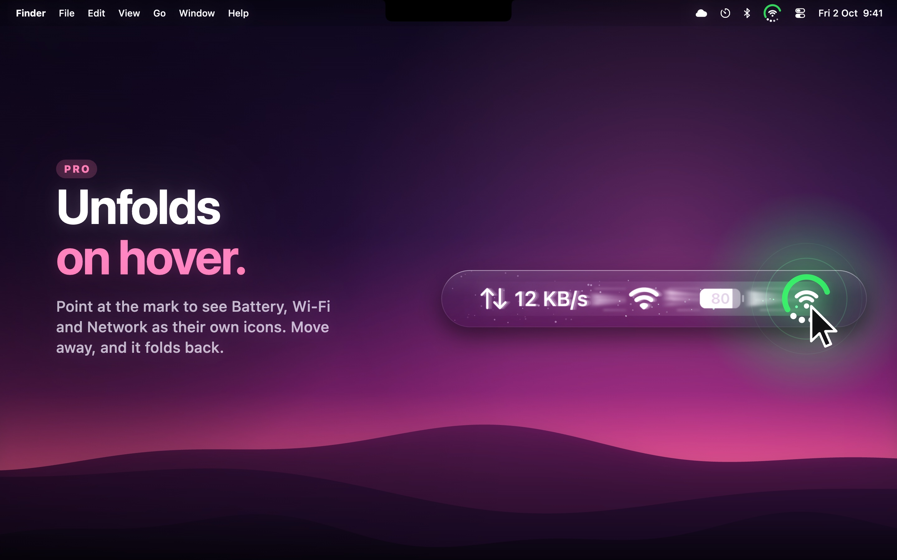
This is the exciting part, and my favorite. Hover the cursor on the icon and it unfolds into separate icons drawn like Apple's own: a battery, the Wi-Fi, a speaker, network usage or whatever you've put in the slots. Click one and its page opens right under it. Move away and a few seconds later they fold back into one. That means you've got all your original icons back whenever you need just a hover away :)
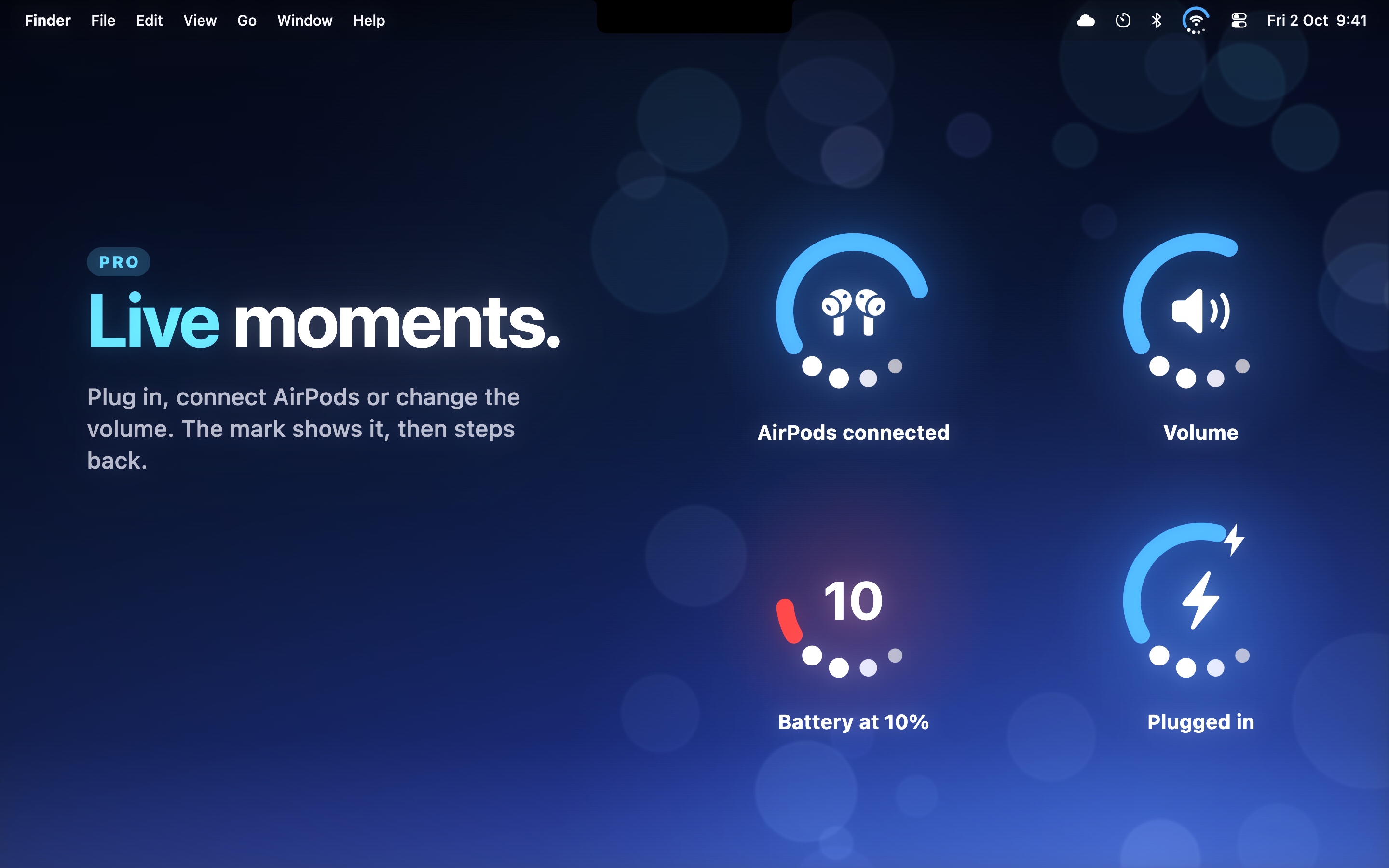
Moments (Pro)
I call these moments. Plug in the charger and the ring shows it. Mute, battery low, lose the network or get it back, connecting your AirPods or drive and the icon tells you for a second, then goes back to your setup.
Make it yours (Pro)
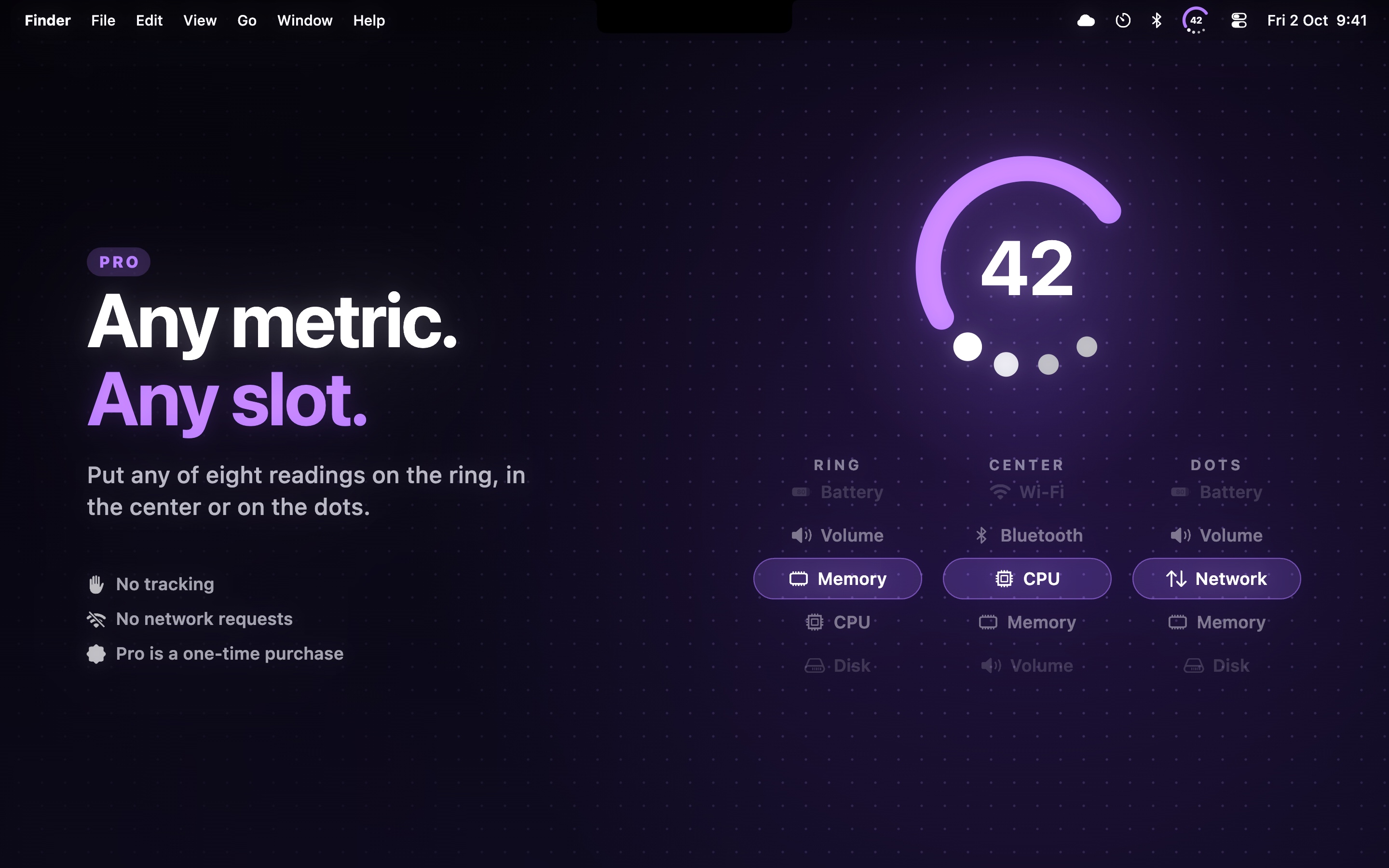
Any of 8 readings in any slot, like CPU on the ring and volume on the dots. Seven colors on top of Automatic and Monochrome, gradient and segmented rings, and profiles to switch your whole setup from the popover. Joining Wi-Fi networks and connecting Bluetooth devices from the popover are in Pro too, still experimental.